
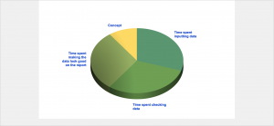
This chart represents just 4 figures 30%, 30%, 30% and 10% and can be produced in a variety of ways. The user can create the chart and enter the four figures. Or, if the system is a bit smarter, the data can be drawn down from a database where the live figures are being recorded.
So apart from the time spent creating the chart and getting the look right your staff could be spending a lot of time collecting the data to ensure that the slices are right. What if the system did this for you as well?
We recently produced a report where for each active design project the project managers wanted to know at what stage the procurement was for several different categories of product (lighting, furniture etc.) With over 10 projects running at any time this could have meant days of work and the whole thing could have been out of date before it had been assembled.
The system we created required automatically produced the reports and emails for each project were sent to the relevant project managers giving them an up to date report. Wherever they were on the planet.
It could be that simple.